Creation of Digital Will Features - Bank Jago UI/UX
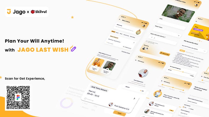
The Project that I Created is a Part of Skilvul UI/UX Bootcamp Program 2022
Hi Guys! Are you interested in this case study ? if so, I will take you to find out all the work processes that I did from the beginning until this case study was finished.
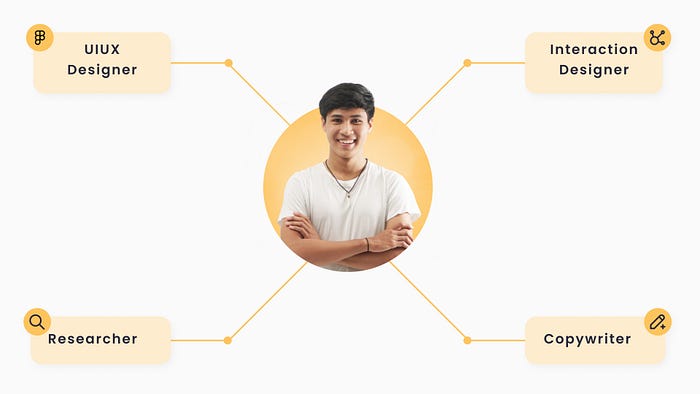
Project Role
Basically, I am fully responsible for this project; Starting from conducting research to the usability testing stage.
Hypothesis / Background
In Indonesian, only a few people have a “Will”. Certain people with good ranks and positions in their jobs, have not even planned to make a Will.
Why ? apart from that, planning a Will is considered like preparing for de*th, which is taboo in Indonesia. Another factor that makes them not plan a Will is because making a Will is quite complicated, and they have to contact a certain notary.
Especially, the decision to make a Will must have sufficiently strong reasons, because changing the contents of a Will is not as easy as turning the palm of our hand.
That’s the reason why Jago Last Wish feature is created. Bank Jago as a Challenge Partner, want everyone to be able to make a Will easily, “as easy as turning the palm of their hand”.
Design Process
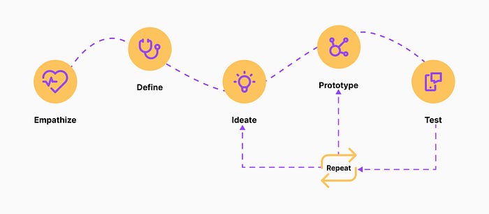
To realize the hypothesis above, I will start by using Design Thinking as a method in the design process.
I use Design Thinking because it makes it easier for me to find “what users need” , and also helps me create solutions based on user needs.
Phase 1 : Empathize
The main goal of Empathize is to position myself as a “User” to feel the difficulties experienced by users in making a will;
and to make sure the results of empathy that I get to be more accurate, I did a secondary research process. I retrieve data via Google search engine, Playstore & Social media,
why not use the primary research method ? , because I need to adjust the processing time that has been specified in this program.

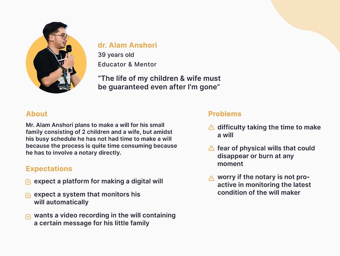
User Persona
I collect some information about users, then I take important points based on my research purpose.
User Research
I started by doing research on wills through various journals and websites from Google search engine, as well as reviews of applications that have features related to wills, such as Bibit “Ahli Waris” feature.
after doing research on the will, I describe the results of this research into a list of Pain Points, below

Key Findings :
- Users are afraid that their digital will can be easily manipulated by others
- It is difficult to access a notary as a conveyer of wills; In the sense that notaries are not always pro-active
- The user must spend more effort to make a will traditionally
Phase 2: Define
After analyzing all the information I got from the “empathize stage” , I continued by summarizing the main problems that must be immediately sought for design solution, through “How Might We”
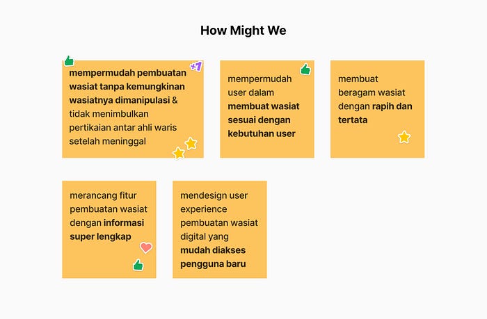
Based on “How Might We” the problem has been found that user want a will that is not easily manipulated by others.

Phase 3: Ideate Solution
I found several solution which I describe in sticky notes, like this
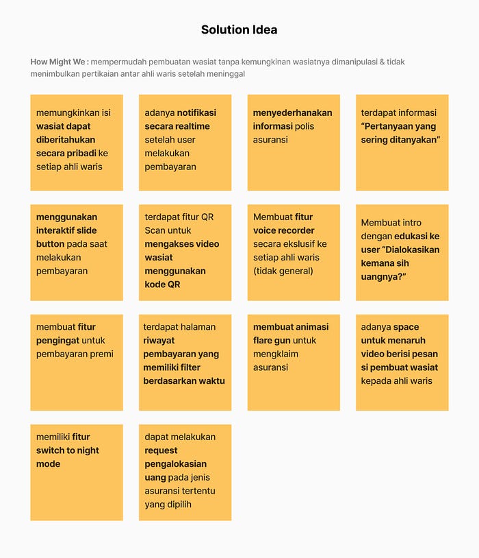
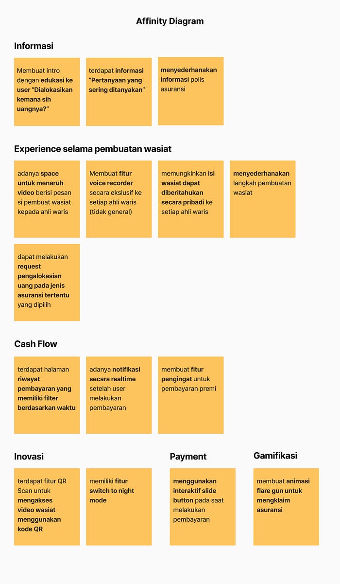
From the solution that I have collected above, then I grouped these ideas into several categories in the affinity diagram :
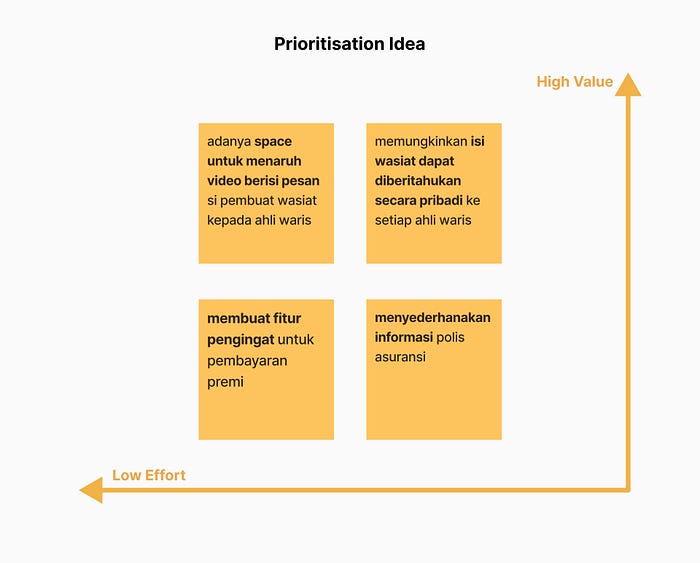
In the next process, before I determine the ideas that need to be worked on first; I group them to be more specific based on the priority scale that I have made, as below
Solution
The following are the solution that came up in brainstorming to solve the problem statement as well as to achieve the user goals.
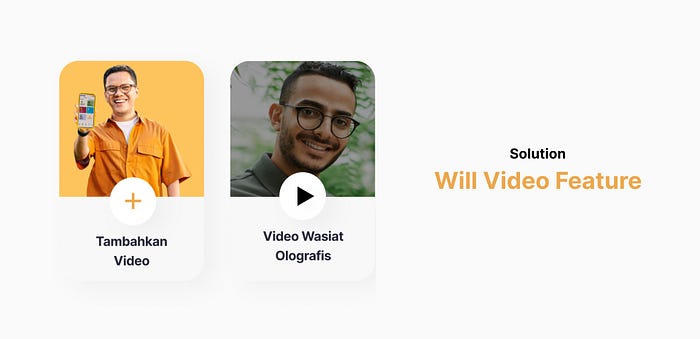
1. Creating a will video feature, with the main objective of validating wills that have been made by users
this feature also allows users to create “will” video for each heir, and upload it to any will that the user wants, besides that is feature can also be accessed with a barcode when claiming a will.
2. Create the system where the users can change the content of the will at any time
In general, if we want to change the contents of a will in a traditional will, we must first to contact a notary, which will certainly take more effort and time; therefore this will setting feature can be a pretty good solution for a more efficient time and of course the flexibility of the user who is more free to edit the contents of his will at any time.
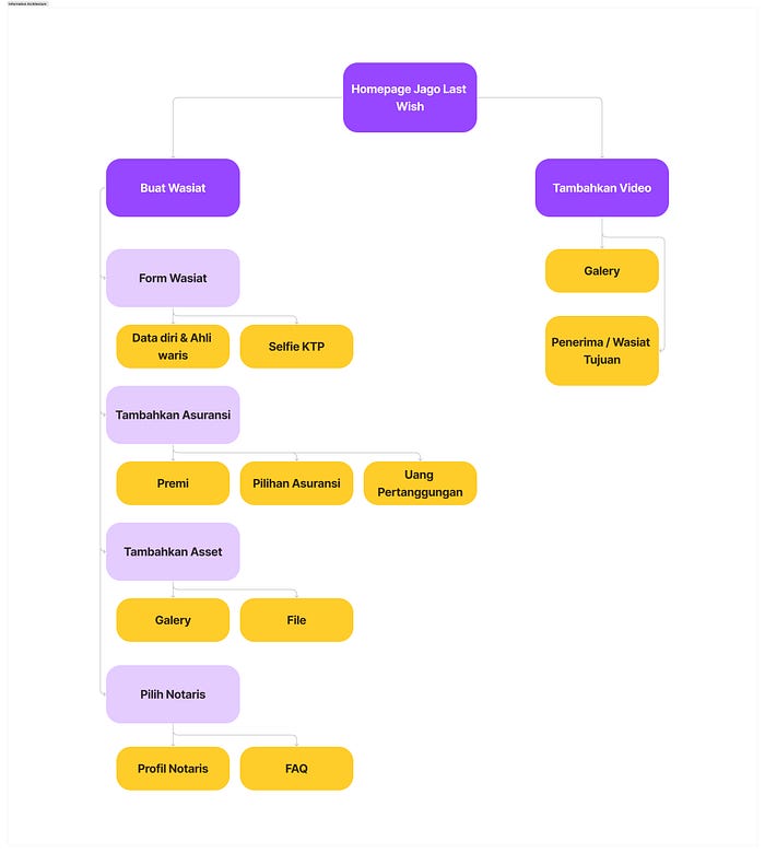
Information Architecture
To further clarify, what information is in the main page that I created, I simplified it into information architecture
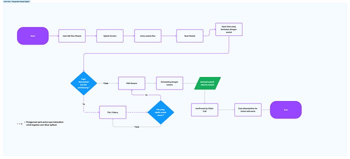
User Flow
User flow aims to describe the user process in using product solutions

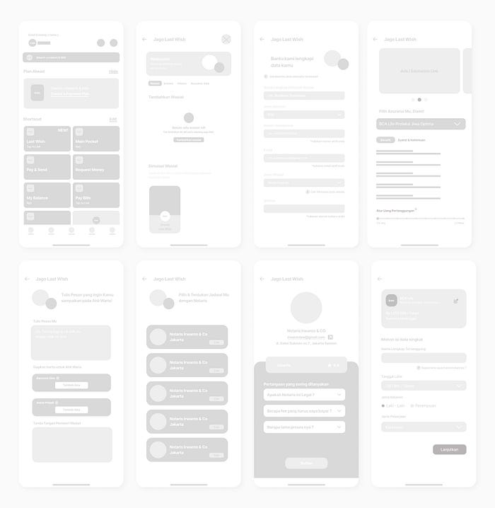
Wireframe
I also make a Low Fidelity Design which will make it easier for me when implementing it into a High Fidelity Design.
Design System
UI Style Guide documentation that I have created, and I entered it into the design system below :
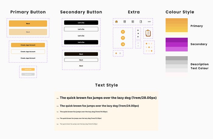
Phase 4 : Prototyping
After the ideate phase, I refined the wireframe into a high fidelity design, and also did prototyping to make the design more interactive, then crated a UI Style Guide as a resource for this design.
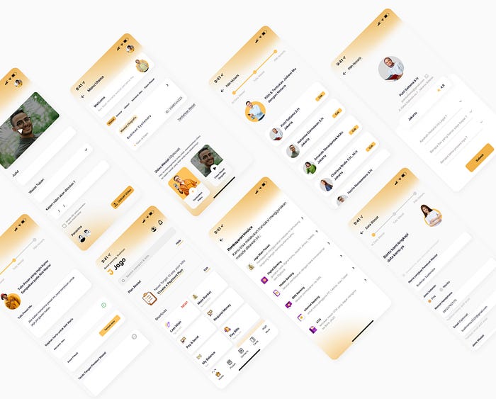
Prototype
Phase 5: Testing
To find out the shortcomings of the solution that has been made, now is time for me to carry out the usability testing process on users who match the criteria that i have set, as below
Target User Criteria
- 25–40 years old
- work as an employe or entrepreneur
- domiciled in an urban area
- middle to upper economic level
- have a good level understanding of technology
- usually use application for daily needs (buying food, transportation, shopping and more)
- well educated
Test Scenario
- Introduction
- QnA Session
- User Test based on task :
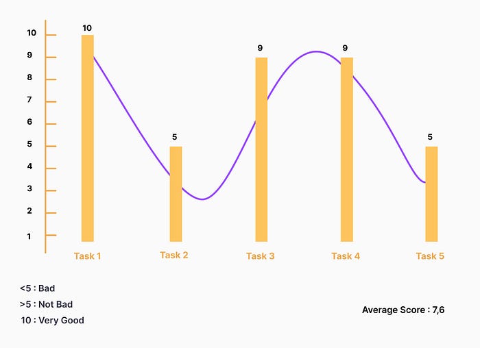
[Task 1] Experience filling out will forms
[Task 2] Choose a public notary
[Task 3] Edit the content of the will
[Task 4] Add will video
[Task 5] Claim a will
4. Final QnA Session
5. Single ease question
watch the interview record click here
The Result
the result of conducting usability testing is :
- Lack of information on the notary profile, such as “how long has the experience been ?
- The user wants the uploaded video to be captioned and sent automatically as well as being watched by heirs at a certain age
- When making a will claim, the user does not find clear follow-up information on the will that has been claimed
Single Ease Question
I ask for an objective assesment of the user, from 1 to 10 how many points are in each task carried out, and the data below is the answer from the user :
Iteration
After getting the results from usability testing, I decided to do iteration based on user feedback which is : The user wants the uploaded video to be captioned and sent automatically as well as being watched by heirs at a certain age.

Before the iteration, the user was very interested in the will video feature, but the user’s interest immediately decreased due to a lack of information that could be filled in the video will,
So, that in this iteration I did an added by adding an information form that can be specified by the user.
Conclusion
From this case study i learned that to get the best solution is to reduce my ego as a designer, and accept any criticism given by users; I also learned that small solutions that we consider trivial are sometimes more impactful than big solutions that don’t provide any benefit to the user at all.
Recomendation
There are several things that can be done about our solution based on user feedback and usability testing :
- Make detailed will claim information
- Complete the details on the notary profile
Thanks for reading ^_^
Let’s Connected :
